In early 2020, Equal Measure launched Learning Circles—a new professional development series for staff focused on three areas: Equitable Evaluation, Facilitation, and Data Visualization. The goal is to build staff expertise and skills in key areas aligned with our strategic plan and mission—ultimately to design and implement projects for our clients that increase learning and facilitate social change. In this post, Senior Director Jennifer Thompson gives an overview of what we’re learning in our Data Visualization Learning Circle.

Senior Director Jennifer Thompson
Engaging and Practical Learning
The Data Visualization Learning Circle aims to improve how we communicate data through the application of data visualization best practices in our reports and presentations for our clients, as well as for broader audiences.
The ten members of the Data Visualization Learning Circle have been completing online courses through Ann Emery’s Depict Data Studios. Ann is a leader in the field and her courses are engaging and practical without requiring special or expensive software.
As we’ve worked our way through the course modules, the Learning Circle has met regularly to discuss what we are learning and its application to our work. We are already making dramatic changes in how we present data in our reports and deliverables, and have identified five best practices for how we communicate with data. Our goal over the next year is to share the data visualization best practices with our colleagues at Equal Measure and incorporate these practices into our project work.
Visualizing Quantitative Data
We produced a comprehensive evaluation report for the Aspen Institute Forum for Community Solutions’ Opportunity Youth Forum, as well as a highly graphic two-pager with key takeaways from the report.
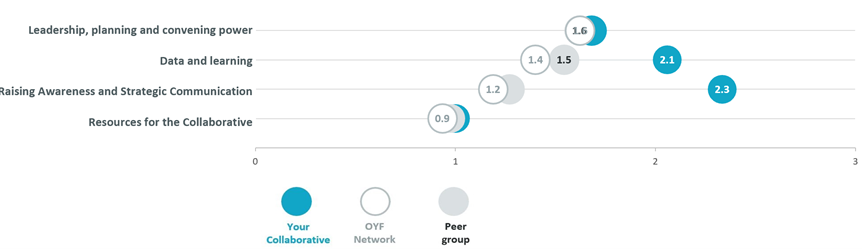
Both documents applied many data visualization best practices, including color-coded report sections, chart titles with the key takeaway, direct labeling of data bars, a variety of charts/visuals (bar charts, a map, scatterplots), and using shading and color to highlight key findings. We also produced reports for each community in the OYF network that incorporated column charts and dot plots (see example below).
In another example, as part of our engagement with JEVS Human Services, we conducted an evaluation of The Choice Is Yours (TCY), a Philadelphia-based diversion program. In addition to a 32-page full report, we developed a six-page executive summary and a two-page infographic which JEVS has found helpful for sharing with a variety of audiences, including Board members, policymakers, and funders.
Qualitative Data Can Be Visual Too
While many of these examples focus on quantitative data from surveys, assessments, or administrative data, we have also applied the data visualization techniques to our qualitative work. In our memo to Robin Hood with findings from more than 40 interviews with Mobility LABs partners and stakeholders, we used icons to represent some of our key themes. For example, in describing the decision-making structures at different sites, we used graphics such as the ones below next to our descriptions of the four types of structures.

Next Steps
As we complete Ann Emery’s modules and distill the best practices, we aim to integrate what we learn across Equal Measure as a whole—among our staff and across our projects, to further help our clients create social change in their communities.
In the next post, two Learning Circle members—Carise Mitch and Kristin Giordano—go deeper into several of the data visualization practices we’ve learned.
Five Best Practices for Communicating with Data
UNDERSTAND YOUR AUDIENCE(S) Different audiences (e.g., funders, Board members, partners, community members, evaluators) have various needs which affect the choice of format and content of the products you develop for them. Ann suggests the 30:3:1 approach—a maximum 30-page report along with three-page and one-page summaries that distill the most important information into brief easy-to-read documents. These varied reports are easy to share with specific audiences; those most involved in a program or initiative may want to read the full report, while other stakeholders, such as Board members or policymakers, may prefer the shorter versions.
DECLUTTER Removing unnecessary clutter in graphs is critical to help readers quickly and easily understand the key takeaways. We have learned to remove gridlines, delete unnecessary words, make labels readable (i.e., no turning your head sideways to read a label!), directly label data (no legends that require back and forth reading), and add more white space.
USE COLOR Color and shading can draw the readers’ eyes to the key message or takeaway from the data. For example, in a line chart, adding color to the line you want the reader to pay attention to, and graying out the other lines, is an effective way to communicate your message. Color can also be used to visually “chunk” content in a report so your reader can easily connect particular content or a section with one color throughout a report.
USE ICONS AND OTHER VISUALS Icons can add visual variety and communicate content; for example, symbols for different industries can help the reader understand and compare data across categories. Other visuals such as maps, diagrams, and timelines provide opportunities to present information in ways that are more engaging than long blocks of text.
TELL THE STORY Ultimately the data visualization should tell a clear story for the reader. Removing clutter and using color and icons can help with this. And so can plainly stating the takeaway in the chart title, or directly labeling a bar or line with what you want to communicate.