In early 2020, Equal Measure launched Learning Circles—a professional development series for staff focused on three areas: Equitable Evaluation, Facilitation, and Data Visualization. The Circles built staff expertise and skills in areas aligned with our strategic plan and mission—ultimately to design and implement projects for our clients that increase learning and facilitate social change. In this blog post, Consultant Kristin Giordano and Carise Mitch, Senior Consultant, Communications, reflect on first steps in the process of building an effective data visualization.
A team of 10 Equal Measure staff members participated in the Data Visualization Learning Circle, combining discussion and reflection with the invaluable Ann Emery’s Depict Data Studio online courses. As we dove deeper into the subject matter, an “aha” moment emerged: the question we needed to ask first was not “how do we visualize data,” but “how do we find the story in the data? Who needs to know that story, and how can we best tell it to make the information actionable and accessible?”
Answering these questions before diving into design, we discovered, saves time and effort. While technology makes it easy to share data, there is no guarantee that a fancy chart will answer the right questions or communicate important findings. Working through some key first steps before drafting a visual ensures our clients can use our visuals to illuminate a problem, a trend, or a solution that will advance social change.
A team makes many choices on the way to visualizing data: how to best collect information; investigating whether the questions we ask are relevant to the people the work is intended to serve; the language we use to ask questions; and how to organize and prioritize data for analysis. As Equal Measure has evolved our evaluation practices to become more equitable, we have aimed to make our data collection choices as thoughtful and intentional as possible. We want to become equally as intentional in designing our visualizations.
In this post, we offer five first steps for making choices that ensure we tell a useful, accessible, and meaningful story with the data we have collected. These are five first steps to data visualization—before formatting a graph.
1. Use quick, messy visualizations to interrogate the data.
Most of our data analysis at Equal Measure happens in teams. It can be challenging to identify meaningful trends in a large set of data with a group, especially when sifting through large quantities of survey responses. We’ve found using simple (and “unpretty”) visualizations like heat tables or data bars helps our team quickly comprehend the direction of the data—were scores going up or down, for example? How did they change over time? Using these less polished visualizations lets our teams spend less time understanding the “what,” and more time unpacking the meaning, or the “so what.”
2. Ask: What are the relationships in this data set?
Just as you can diagram a Hallmark Christmas movie and show how the main character has relationships with her “mean boss,” “best friend,” and “handsome veterinarian she meets when she moves back to her small hometown,” data stories have several common types of relationships that can be illustrated through visualization:
| Visualization | Relationship |
|---|---|
| Relationships over time—1, 2, or 3+ points in time | |
| Relationships across groups: comparisons | |
| Relationships within a group—for example, comparisons of part to whole | |
| Relationships between variables—correlations, distribution across a spectrum | |
| Relationships between places or people—shown through maps | |
| Progress toward goals |
3. Ask: Given the relationships in our data, what kinds of stories can we tell? What stories will be most meaningful to the audience?
Understanding which type of story you can tell with the data can narrow down potential visual directions for the final product. Possible stories include:
- What’s going well? What’s not going well?
- Did we reach our goals? Why or why not?
- How did findings differ across different participants or groups? Disaggregating data can uncover disparities that are less evident in the full set.
- What is surprising? What happened as expected?
- Who needs this information?
- What increased over time/decreased/stayed the same?
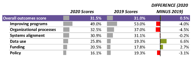
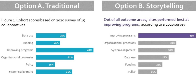
The figure below, modified from a project where we evaluated progress across a group of sites in a cohort, is an example of taking the same information from just “what we found” to a meaningful story discovered in the data. Rather than showing data without directing attention to meaning (Option A), Option B adds context and directs attention to a specific story in the data. Here, the story we chose to tell is “what the worksites are doing to improve programs is going really well!” An alternative story could be, “policy work is more of a struggle.”
4. Ask: Who can benefit from hearing this story and how will they best absorb it? How can the story be useful?
“This is all about unlearning what we learned in graduate school,” said one Data Viz Learning Circle participant.
Our formal education trained many of us to present information to technically sophisticated audiences, using standards and language that demonstrate our own facility with an academic field. Findings from our work, however, are often relevant to audiences who don’t have a technical background in evaluation, including members of staff and leadership at foundations and nonprofits, as well as residents, students, teachers, and patients. Using only highly technical communication prevents what we’ve learned from being used broadly and can be a harmful form of gatekeeping.
Though it might not seem so at first glance, taking something technical and making it accessible, even inviting, to non-technical audiences is a very sophisticated exercise—and visualization helps with this translation. Understanding who needs to hear a story and how they want to see it demonstrates respect for people’s time, training, and interests. Considering the needs and interests of a broad audience and designing with them in mind makes information less opaque, more accessible, and more equitable.
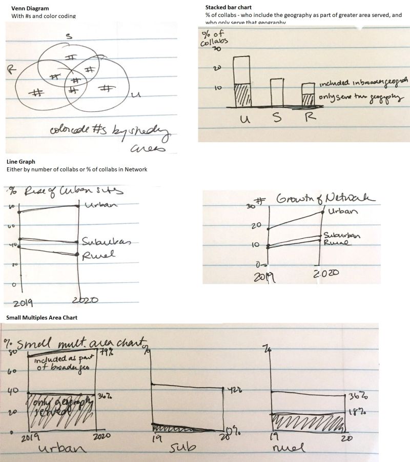
5. Before designing your public-facing data visualization, get a napkin.
There are so many exciting tools for visualizing data, but we found that sometimes the most useful tool is a scrap of paper. Sketching lets us test our stories, think about audiences, and explore relationships in the data before investing time and effort to make the visuals “pretty.”
Sketching requires getting comfortable with messiness and iteration—for example, we decided NOT to visualize the data in these sketches at all, because it wasn’t part of the broader story. This choice was made easier because we spent less time exploring and designing different options than if we’d done the same process in Excel or another program.
Use these five steps to get to something beautiful and useful.
These five steps can help find a useful story in the data and prepare a team to design easy-to-comprehend data visualizations that bring the story and the evidence to life. These steps let learnings emerge from behind a wall of opaque “expertise” and enhance use of the data. After moving through these steps, feel free to open the software of your choice and design a visual for a broad audience that will make findings both beautiful and useful. See some of our recent infographics here:

Kristin Giordano, Consultant

Carise Mitch, Senior Consultant, Communications